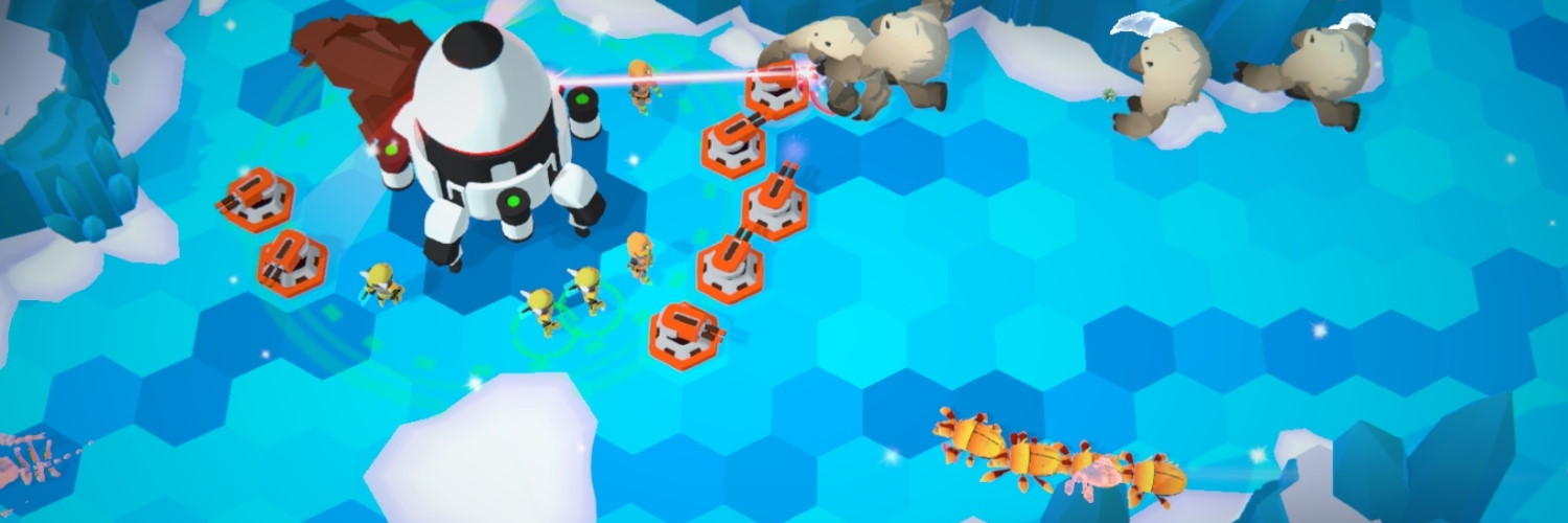
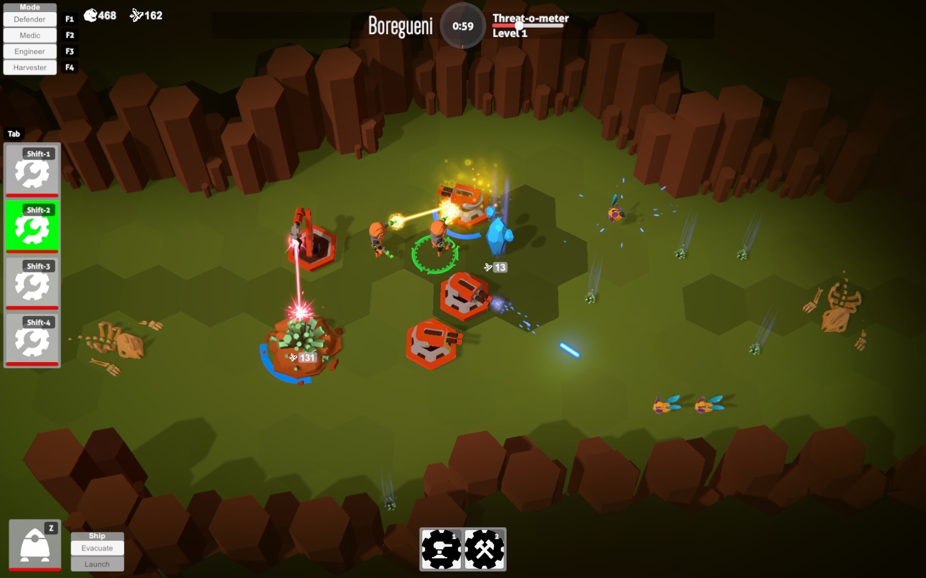
Oh, darn. I missed a whole phase back at the end of 2017.
It’s been quite a while since the last update, figured the halfway point of the year was a good time, and fortuitously my Phase 7 to-do list was completed at the same moment.
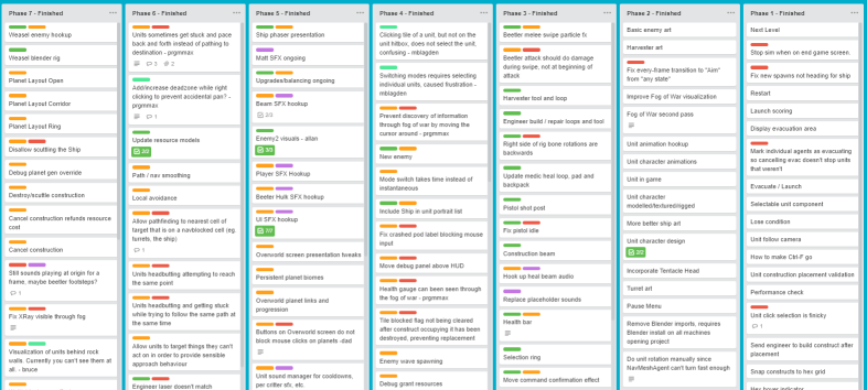
Continuing the project while back at my day job as really brought home the value of properly tracking tasks in a to do list. With only an hour or so every day spent on the project, progress is slow, sometimes so slow it feels like nothing is getting done. But it is!
Without tracking those tasks, it’s easy to trick yourself into thinking that you aren’t making progress. When you do track your work, you can look back after a month or two and see clear evidence of progress. You might even be able to do crazy things like plan your scope, or make estimates and schedules.
Phase 6
This phase covers the period last year between going back to work full time in October and the end of 2017.
Music
One of the first big elements of the game to actually reach a state resembling completion was the music.
In addition to the previously completed Main Menu, Overworld and Desert tracks, the Arctic and Forest biome tracks are now complete. Having unique appropriate music for each biome contributes a lot to the feeling of “place” while on each planet.
All of the music in the game is by composer and friend Carl Corcoran (@tenfour2) who also did the music for the indie game C-Wars.
Art
The player units got death animations, so dying is a little more dramatic now beyond just disappearing or fading away.
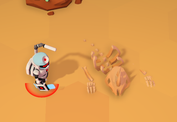
Work started on refining the planet level artwork, both by creating new art assets and extending the world generation rules for placement. Resources, and the escape pod got new models, and a fair amount of visual polish was done on the desert biome in particular.
Gameplay
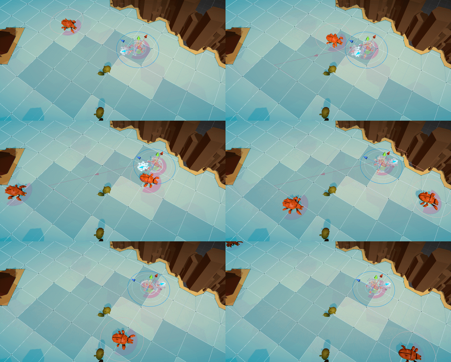
I lot of programming work during this time went towards replacing Unity’s pathfinding and navigation system that I’d been complaining about for months. Finally in order to create the behaviour that I wanted, I needed to confront the issue instead of just hacking around it as best I could, as I had been until that point.
There were a few obvious choices on the table…
Upgrade Unity?
I tried an upgrade to Unity 2017.2 in the hopes that some of the NavMeshAgent bugs that existed in 5.6 that were supposedly fixed in 2017 would resolve at least some of the issues that I was seeing. Not only did the upgrade not resolve the bugs, but it completely broke pathfinding in some mysterious way that I wasn’t able to quickly pinpoint.
Given the choice of debugging these new problems in the hopes that after overcoming them the original set of problems would actually be resolved, I abandoned the upgrade. Even if both issues were ultimately resolved, it was still mostly a matter of kicking the can down the road, making things behave slightly better, without completely solving the issues that I was going to face eventually.
Asset Store Navigation Packages?
I did spend some time investigating a few different navigation packages on the Asset Store. There were several that looked quite promising, unfortunately everything I looked at suffered from a range of issues including:
- Outdated and apparently lacking in developer support
- Specific navigation mesh generation requirements that didn’t mesh well with the way I’m generating levels
- Lacking the specific behaviours I needed so I would have had to write that part anyway
- The author being a asshole to his customers in the Asset Store comments
It’s times like these were I run up against the conflicting personal drives of: why should I pay for somebody else’s half-assed solution when I can build my own half-assed solution for “free” vs. I’m lazy (“practical”) and would really prefer to spend a few bucks to save many days of work.
Which brings us to…
Write It Your Damn Self?
Ultimately I did just grit my teeth and replace my use of Unity’s navigation meshes and agents, with my own custom solution. I do my own pathfinding on my own navmesh, and use a custom agent to move the units along those paths.
I suspect that most people (my past self included) don’t realize that path finding isn’t really the hardest part of getting a character to move from point A to point B in the game world. Path finding has very good, well known solutions like A* (“a-star”). There are details of course, even just implying that A* And You’re Done makes me cringe a little, because it’s *Never That Easy*. But a big part of the problem is path *following*, that is moving your character along the path that you’ve found in a realistic, accurate, aesthetically pleasing, mechanically sound way.
This is the job of the NavMeshAgent component in Unity, and the problem is it’s quite bad. It does a decent enough job of getting you up and running with Unity’s built in navmesh generation, but it lacks fine grained control over various aspects of how the character moves through the world that make it unsuitable for any purpose other than just moving a simple character over a simple mesh terrain. If you have specific ideas about how you want this character to move, when and how to turn, when and how to stop, and so on… you’re going to have a bad time. It’s not a big problem that the default behaviour isn’t great, but it is a problem that there are basically no means provided to customize that behaviour.
This is likely partly why there are a good selection of 3rd part assets available to replace the Unity one, but my impression is that they also tend to suffer similar limitations.
Getting your characters to move and behave just the way you want in your particular game tends to be a very detailed and finicky process, one that you really want completely control over in order to get things just right.
I might not be all the way there with my custom solution, but I was able to solve the issues I set out to, and know that I have access and control over making future improvements.
More Gameplay
In addition to the navigation rework, a few more mostly quality of life improvements went in such as optional edge panning with the mouse cursor, and the ability to target objects that a unit isn’t currently able to act on.
For example a Defender unit can target a harvestable resource, and with pathfind and stop near it, even though it can’t be attacked. Or a Harvester can target a Defender in order to follow along behind it. This also allows targets to persist through mode changes, so that Harvester can be switched to a Medic and can now heal the unit it already had targetted. Overall it just makes target and follow behaviour more consistent and understandable.
Phase 7
This phase is the whole first half of 2018. Boy does time fly.
Art
Environments
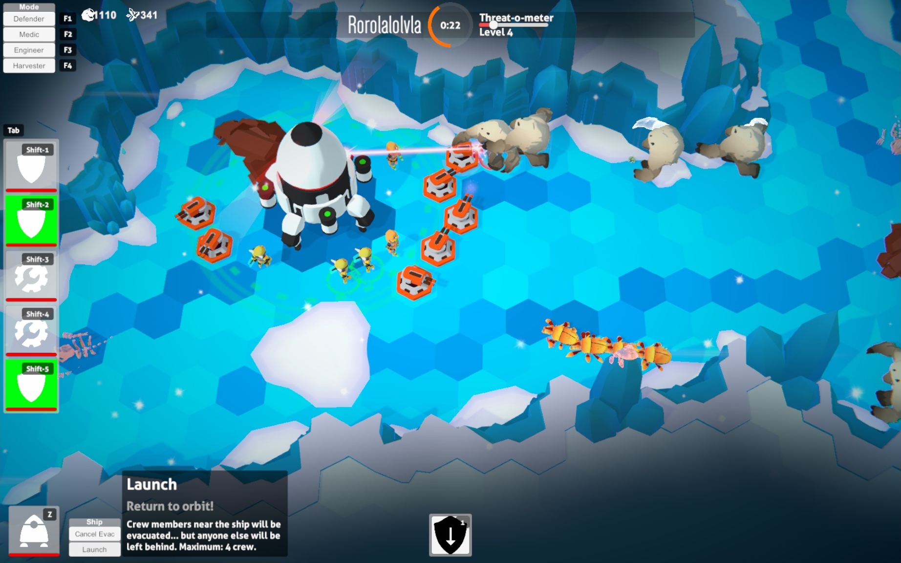
There was a big jump in environment quality during this time as we worked on new environmental assets, as well as improved procedural generation rules for placement.
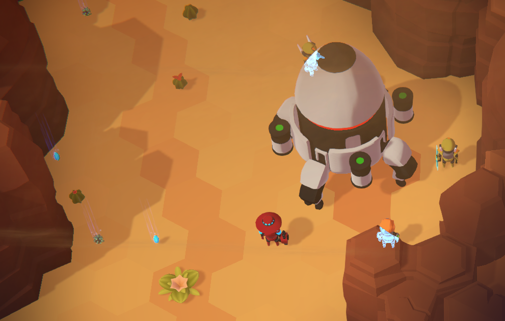
The Desert and Ice biomes were flushed out with improved wall art and decor elements. The landscape outside the “walls” of the play area was raised up in a plateau giving the impression that the game play area itself is sunken down like a canyon. Some basic atmospheric particle effects were added, blowing snow and dust as appropriate.
More recently I’ve finally gotten around to adding additional variation to the planet level generation, and there are now 4 different templates which create planet levels in various shapes, which I’ve dubbed Hub & Spoke, Ring, Corridor, and Open. The additional variation should hopefully add another dimension of variety between different planets.
Enemies
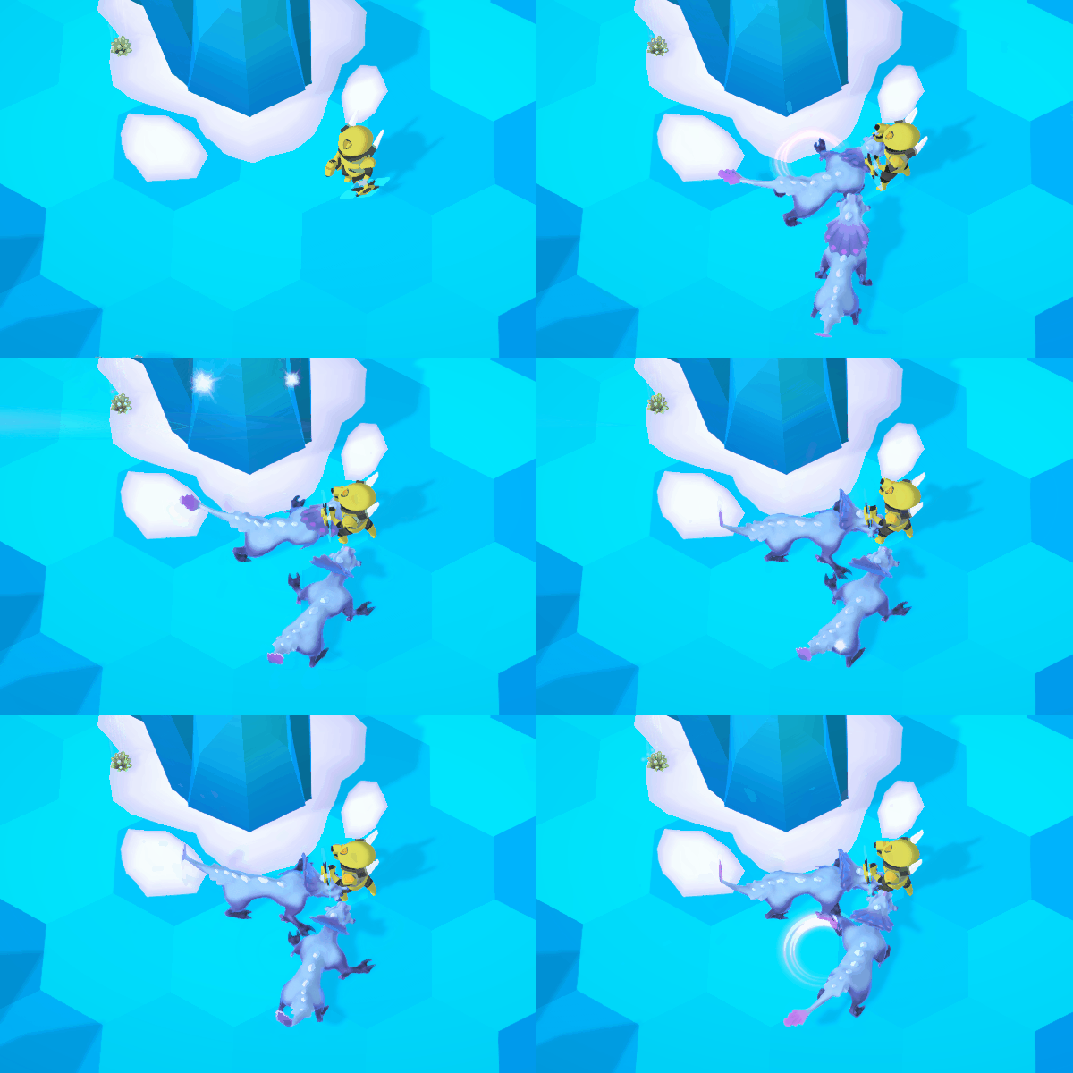
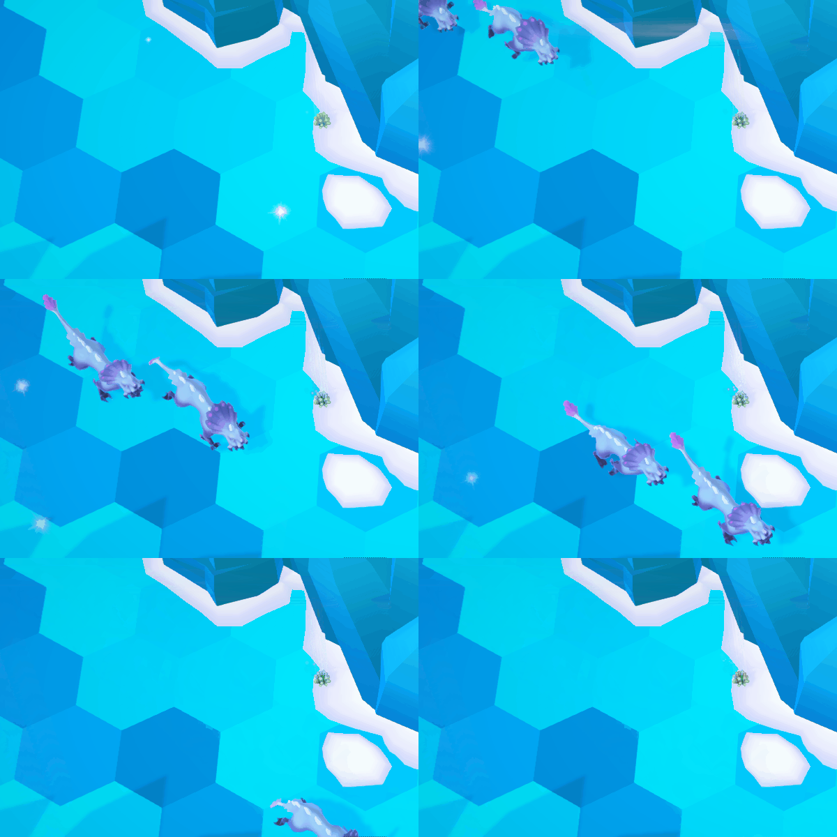
The Desert enemies were completed with the addition of a Bee warrior. And the Ice biome is off to a strong start with a large tough Yeti and a smaller and faster Weasel. A third Ice biome creature The Worm, is already underway.
Even though the creatures are in game with complete art assets, there’s still some design and programming effort that needs to go in to each one to really make them stand apart in their behaviours, beyond just looking different.
Player Units
Player units finally all got modeled gear, replacing the grey placeholder boxes they’ve been using up until now.
Some additional work went into polishing player unit animations, in particular the Defender now has idle and attack variation animations used when in the Hunker Down defensive stance.
X-Ray Vision
Due to the camera angle in the game, and the size and positioning of units relative to the environmental walls, the ship and other large objects, it’s sometimes possible that enemies, or your own units, might end up completely hidden by the walls in the game, or when standing behind a larger object like the landing ship.
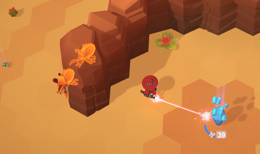
To solve this issue, as many games do, an x-way vision effect was added, so that any part of a player or enemy unit that is hidden by another object will be visible in outline.
This presented a challenge as both this isn’t an effect I’d implemented before, as well as being generally not that familiar with Unity’s particular brand of shader definitions.
As it worked out, it was relatively pain free to set up a basic x-ray effect and get it working in game. I had seen some of the excellent shader tutorials by Dan Moran on his Making Stuff Look Good channel, and used his as a starting point.
However there was a snag with how this effect interacted with the Fog Of War effect already in From Orbit. If an enemy that was supposed to be hidden in the Fog of War passed behind a wall and engaged the X-Ray effect, that part of the enemy that was X-Ray’d would be visible on top of the fog of war. This both reveals the enemy, and also just looks like a glitch where you see some fraction of an enemies toe, elbow or tail.
If you haven’t worked with shader programming, I am not equipped to accurately convey just how annoying these kind of problems are to solve. To be clear, I am neither an expert in either rendering or shader programming, but let me tell you, shaders are some crazy black magic, on another level beyond the normal, benevolent, arcane and white magics normally employed by most programmers.
For starters, you cannot generally take one shader and use it in addition to another shader. If you want more than one effect to display, you must create a single shader that does all of the things you require. This is not always a trivial task, and may approach impossibility if the requirements of the two effects conflict.
I exaggerate, but the point is, this stuff is hard. A shader is a cursed spell that you shout into the void (via your graphics card), and hope that the spirits beyond bless you with appropriately coloured pixels in response, and do not (for example) curse you with eternal darkness and/or blood dripping down your walls.
Anyway, after a week of investigating various alternative ways of implementing the effect, trying a few, and more reading about how Unity shaders work, the issue was eventually resolved. :tada:
Sound
Sound effects continued to roll in, with some more landing ship related effects, including hits, low health warning, and death explosion.
Switching between different player unit modes each have a unique effect, and there are new feedback effects for resource collection.
Gameplay
There are now hotkeys available for unit mode switching, as well as for activating abilities on a selected unit’s action bar. These aren’t customizable for the time being, and a future task is to revisit hotkeys and key binding throughout the game.
Engineering buildings (Turret and Auto-Harvester) can now be canceled after they are placed but before they have completed building which will refund the full cost required to construct that particular building.
Buildings can also be scuttled, or destroyed intentionally by an engineer to remove it from the playing field. Particularly useful if you’ve managed to build yourself into a corner and can’t get free. For now this doesn’t refund any resources, but this is open to design tweaks later.
Resource pickups were added to the game to reward exploration. These are small amounts of resources spread around the environment that can be collected by any player unit simply by walking over them. They’re plentiful enough to be valuable to collect, but not enough that regular harvesting isn’t required. As a side effect of resource pickups, the numbers involved needed to be re-tuned, in order to be able to provide smaller amounts.
The Threat-o-Meter was also reworked to be more responsive to player actions. Previously enemy wave strength was entirely controlled by time progressed on a planet, but while wave spawning still occurs on this schedule, the strength of force you will face is increased in part by exploring, gathering resources, and engaging in combat.
Onward
A certain level of base functionality has been accomplished on the technical side, and most remaining work comes down to content.
Art Goals
My goals for basic content are 3 different biomes (Desert, Ice, Forest) each with 3 unique enemies per biome for a total of 9, and the possibility to extend the enemy creatures with skins, variations etc.
2 of 3 biomes are in pretty good shape (Desert and Ice) with only Forest remaining.
Similarly 5 of 9 enemy creatures are in game, with a 6th underway.
After that, the bulk of the remaining art content will be:
- Forest biome (environment and decor elements)
- Forest Creature A
- Forest Creature B
- Forest Creature C
With each enemy type taking about a month to create and get in game, it seems reasonable to aim for completion on that front by the end of 2018.
At some point, we’ll also need to do an art pass on the UI, and replace all of the gross default Unity buttons everywhere.
Design Goals
Design content is much harder to reason about than art, and will certainly create more programming work as new features will be required to implement new design elements. That being said, general goals for design work that remains:
- Additional player abilities
- More engineering buildings
- Medic cooldowns
- Harvester abilities
- Defender attacks
- Unique enemy abilities
- New movement / attack patterns
- New attacks (eg. DoTs, channeled, AoE)
- Environmental points of interest
- Ruins
- Teleport pad
- Treasure chests (appropriately space themed)
- Minibosses (champion variant of existing enemies)
- …
And finally, the ever elusive “tuning” and organizing the content in a way that makes sense, and provides a reasonable sense of progress and progression for the player.
This is a pretty sizable chunk of tasks, with widely varying amounts of risk and effort involved. But they’re also of the nature that they are largely independent of each other and can be chipped away at, one by one. The exception being tuning and progression, which necessarily involves looking at all of these things as a whole.
Technical Goals
For the rest of this year, the primary technical goals are simply to support the work being done in design and content.
Down the line, there are still some important but… shall we say… less fun items to be taken care of on the programming side. Including:
- Controller support
- Keybind remapping
- Localization / translation
Sometimes it doesn’t feel like it, but the big old task list is getting shorter every week. Here’s to the next 6 months!
